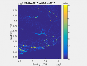
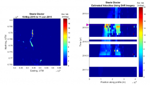
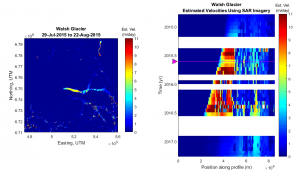
Within each movie, the speckle tracking in multi-temporal Sentinel-1 SAR images is presented on the left. The plot of the glacier velocity over time and over locations along the length of the glacier is presented on the right. A magenta triangle is used to indicate the approximate time of the frame on the left with the corresponding row in the plot on the right.
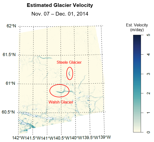
For both the Steele and Walsh Glaciers, their surges appear to have significantly subsided (and possibly ended) within the second half of the year 2016.